TYPOGRAPHY - EXERCISES
27/03/18 - 01/05/18 (Week 1 - Week 6)
Mohamad Irfan Mohamad Zaim (0326620)
Typography
Exercises
LECTURE
27/03/18 (Week 1)
In the first lecture of the semester, Mr. Vinod gave an overview of the course and went through the Module Information Booklet with the class, explaining the objectives, marking criteria, and how to setup and write our e Portfolio. The overview was followed by an introduction to typography.
Essentially, Typography is printed or written letters, numbers, symbols and more (type) which have been given form and conveys a message. The arrangement of the type involves selecting prefaces, point size, line length, spacing, and more. These arranged type make written language legible, readable, and appealing. Mr Vinod went on to discuss to importance of typography and why the art is used everywhere. Typography is everywhere, on signs, media, textbooks, and newspapers. Without a correct understanding of typography, it would be harder for the readers and audience to digest the information. This is particularly important to people who are visual learners.
We then looked more into the history of Typography and its origins. 'Calligraphy' and 'Lettering' was also discussed where calligraphy is anything that is written, and lettering is drawn letters. Typography can be either calligraphy or lettering. We then learned 3 new terms used in Typography:
Mohamad Irfan Mohamad Zaim (0326620)
Typography
Exercises
LECTURE
27/03/18 (Week 1)
In the first lecture of the semester, Mr. Vinod gave an overview of the course and went through the Module Information Booklet with the class, explaining the objectives, marking criteria, and how to setup and write our e Portfolio. The overview was followed by an introduction to typography.
Essentially, Typography is printed or written letters, numbers, symbols and more (type) which have been given form and conveys a message. The arrangement of the type involves selecting prefaces, point size, line length, spacing, and more. These arranged type make written language legible, readable, and appealing. Mr Vinod went on to discuss to importance of typography and why the art is used everywhere. Typography is everywhere, on signs, media, textbooks, and newspapers. Without a correct understanding of typography, it would be harder for the readers and audience to digest the information. This is particularly important to people who are visual learners.
We then looked more into the history of Typography and its origins. 'Calligraphy' and 'Lettering' was also discussed where calligraphy is anything that is written, and lettering is drawn letters. Typography can be either calligraphy or lettering. We then learned 3 new terms used in Typography:
- Font
- Typeface
- Type family
While the term 'font' has been manipulated and interpreted differently by different people, the term font originated as the process of designing a typeface or typeface family, which comes from another term 'foundry'. However in class, the term will be used to describe the 'style' of a typeface. In other words, the weight within a typeface, i.e: Times New Roman Regular, Times New Roman Italic, Times New Roman Bold. The 'Typeface' refers to the entire family of fonts that share similar characteristics, which is what is commonly known as the meaning of font nowadays. Lastly the 'Type Family' refers to all the different styles or weights within and individual typeface.
03/04/2018 (Week 2)
This week was all about using a calligraphy pen and practicing 3 types of strokes and choosing a hand to practice as well. After familiarizing ourselves with holding the pen and technique, we started with horizontal and vertical lines on graph paper, followed by circles. We then had to choose a hand to work on which are Blackletter, Foundational/round hand or Uncial. After choosing a hand we had to write the letters A-Z.
10/04/2018 (Week 3)
This week we learnt about the timeline and development of Typography. It was mentioned that most written work and books on typography are written from the western world.
In history, uppercase letters consist of lines and circles at its core. The earliest development of letter forms were called Phoenician. Phoenician was based on sounds things made. Phoenician was then evolved to what we know as Greek, which then developed into Roman. The Greeks were responsible for inventing 'Boustrophedon'. Lines of text were read alternatively from right to left, then left to right. Instead of spaces the Greeks used dots which is later used in punctuation like today.
Fast forwarding in time, typography developed to be revolved around 'square capitals'. This method of writing was slow and difficult to write. Later the compressed version of square capitals was used, known as 'rustic capitals'. Due to how compressed it was, the use of rustic capitals saved space on parchment, which also saved money. Parchment was the paper used back then, however things were written on animal skin. The writing tool required was easier to use than square capitals, however because they were compressed and saved space, it made it harder to read.
17/04/2018 (Week 4)
This week we did not have lecture as we used the time to show our work from the previous work for Mr Vinod and Mr Shamsul to review. We then proceeded to work on out next task which was to creating letter forms on of our names which represented one of our personalities. This was done on illustrator and we had to choose one that best fits our chosen personality. After that we proceeded to create a GIF using Photoshop that enhances the personality.
24/06/2018 (Week 5)
No lecture.
01/05/2018 (Week 6)
No lecture. Public Holiday.
INSTRUCTIONS
EXERCISE
Calligraphy (Week 1 - 3)
The first part of this weeks exercise was familiarizing myself with the calligraphy pen and developing proper technique to do the strokes. Fig 2.1 and 2.2 was on practice paper. I focused mainly on the circles as it was the most difficult for me.
After finishing up the practice in class, I went straight on to trying out the different hands. I felt uncial was the easiest of the three as it is a combination of straight and curved lines. Blackletter consists of only straight lines which seemed to be the most tedious to me. I decided to settle with Foundational/round hand to do the lettering for.
Week 3 - Quotes
This week we had to choose a quote to write out using the selected hand and lettering practice from last week. Fig 3.1 is me practicing writing the quote and trying to find the right composition and spacing.
Week 4 - 5 Type Expressions
After taking Mr Vinod's advice to make the outlines of the letters have gaps, I decided with using squiggly lines that aren't connected. This was done using the brush tool in Illustrator.
FEEDBACK
Week 2
General Feedback: Today in class Mr Vinod explained how we should be working towards consistency rather than perfection with out strokes. The surface we are working on could have a slight impact on our strokes as well, so putting something flat under the graph paper will provide a smoother surface for smoother strokes.
Specific Feedback: Mr Vinod advised me on the angle of the pen and how it doesn't change at all no matter what stroke or hand is used. When he saw my horizontal and vertical lines, he said the ends of some of the lines were not slanted, meaning I held the pen close to a 90 degrees angle from the paper. To practice being consistent with the angle, I chose the Foundation hand as it is a good indicator to when my angles are off.
Week 3
General Feedback: Mr Vinod told the class to write our names in pencil on our work. When practicing on graph paper, he told us to draw two lines to make an 'X' to find the middle point. He also told us to be mindful of how much space there will be for a line of quote on the right side of the paper.
Specific Feedback: Mr Vinod told me my horizontal and vertical lines were good, aswell as my circles. However my letters were rated a 2/5. There is inconsistency with the size and placement of the letters on the line. For example the top of letter g should not start on the top half of the x height, instead it should start on the x height and pass through the baseline. For my lettering Mr Shamsul commented on my strokes and how it does not look like the foundation reference in terms of the width of the lines. Some of my S letters were done in one stroke, instead of 3. I seemed to also press too hard but this may be due to me using 2.0 instead of 3.0. I should also take my time and do the strokes slowly and precisely.
Specific Feedback: Mr Vinod said my final submission of the quote on plain a4 was a good effort, however there are things that can be improved. He said it was a wise decision to use a smaller size for the lettering, but it can be improved by making the space in between the letters tighter and that the horizontal stroke on my capital T was done incorrectly. He also said some of the letters look blotted, which could be due to me applying too much force on the paper or the quality of paper itself. For the animated type expression for my name, Mr Shamsul suggested that I can use only 2 frames/artboards to make my squiggly outlines move. Mr Vinod said that the black sections around my letters should reinforce my personality instead of just looking better.
Week 5
General Feedback: Mr Vinod told us to reformat our blog. We need to follow the blog format and make it clear for the viewer what we want to convey. He also told us to rework and improve our type expressions if we want.
Specific Feedback: Mr Vinod said my 'drunk' type expression wasn't strong enough. The allignment and position of the letter D in my dead wasn't done properly, and the gradient in my 'loud' wasn't necessary. He said the rest of my words were fine. My quick animation was not quick enough so I have to make improvements.
Week 6
No feedback due to Labour day holiday.
REFLECTION
Experiences:
Week 1 - This week was the first class, so it was just an overview and briefing of what is to come in the coming weeks. No activities/exercises were conducted apart from creating this blog.
Week 2 - This was a fun yet tedious exercise. Doing the same strokes for hours straight was mentally and physically draining but it was rewarding when my consistency and technique improved.
Week 3 - It was difficult to get the right position for the words of the quote and figuring out which letters should be written in a line. However it was good application of the lettering drills done last week.
Week 4 - It was enjoyable to use illustrator for a change rather than using pen and paper. It was interesting to make my first 'animation' of the semester.
Week 5 - It was challenging to come up with 6 type expressions and then choose the best one to animate. While it is challenging, it really makes me use my creativity and my knowledge on Illustrator.
Observation:
Week 1 - I noticed I had not taken any notes since before the holidays. My handwriting was a mess and my note taking was all over the place.
Week 2 - I noticed when I am holding the pen at a weird angle I end up compensating by pressing harder with the pen, which is damaging to the pen and the strokes. Each time the angle felt off I would get the feel for the right angle by practicing again on a different piece of paper.
Week 3 - While my technique and strokes have improved a lot, there was very little improvement in terms of my lettering looking like the foundation/round hand reference. The spacing and composition was there but the lettering was not quite right,
Week 4 - My classmates had very unique and interesting type expressions. I got a few ideas just by looking at what others had planned. I also noticed most people had started making many art boards for their animation while my type expression only needed 2.
Week 5 - I noticed that some of the type expressions from my classmates and myself were quite similar. There may be so much we can do without distorting the letters.
Findings:
Week 1 - My notes are easier to understand if I draw quick diagrams or mind maps when writing down a lot of information in a short amount of time.
Week 2 - Every time I became conscious of the angle I was holding my pen, I would usually mess up my stroke or readjust to the wrong angle. This made me realize that my strokes are more consistent if I don't think about it too much and press too hard on the paper by letting my hand go on the paper. I was trying too hard to replicate the lettering from the reference rather than improving on the consistency of my strokes.
Week 3 - I realized that using a 2.0 calligraphy pen made a big difference in how my lettering turned out. In order to compensate for my thinner pen my lettering size should be smaller. This would also improve the lettering as it easier to differentiate between the thinner and thicker strokes.
Week 4 - I noticed I'm not doing as much practice and work at home as much as some of my classmates. If I were to do more practice and higher quality draft work, it could result in a better final outcome.
Week 5 - If I'm going to produce quality work and get Mr Vinod's approval on my work, I'm going to have to take his advice properly and try my best to implement it.
FURTHER READING
BASICS DESIGN - TYPOGRAPHY by Gavin Ambrose and Paul Harris
27/3/18 (Week 1)

X-height
A method used as a layout anchor to produce consistent positioning of images and text blocks is called X-height. The term is applied when the distance between the baseline and the mean line of non-ascending or lower case letters. The reason 'x' is used is because it is flat at both the bottom and top. In short, the X-height is a relative measure specific to the typeface being set. The measurement of the typeface will be different for every typeface, even if the point size is the same.
Absolute and Relative measurements
Absolute measurements is simply the measurement of fixed values. A milliliter is a precisely defined increment of a centimeter where both points and picas which are basic typography measurements have fixed values. For instance, a 60 point typeface would form and fit on 5 grid lines, each being 12 points apart. The 60 point typeface will sit within these lines rather than being equal to the measurement. This point system was developed by Pierre Fournier and Francois Didot in the 19th century. The point size of a typeface is measured from the ascent line to the descent line, where the system was originally created for metal type.
Some typographical measurements are relative to the point size of the type being set. This relative measurement is commonly used to set dashes, fractions, and spacing. An 'Em' set in 60pt type is 60 points, and an em set in 70pt type is 70 points. An 'En' is half the size of an Em.
03/04/18 (Week 2)
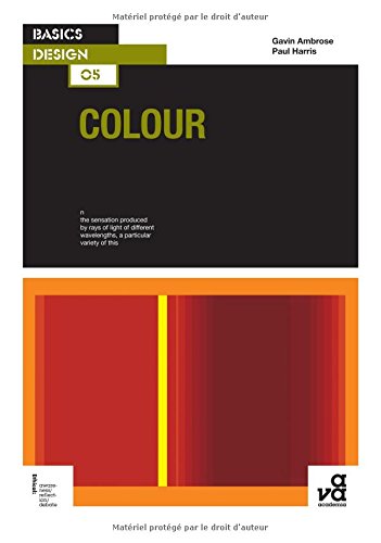
An important design element that can be implemented with Typography is colour. Using the right colour will create the best impression when the audience looks at the types. It is crucial in websites and other media where first impression is everything. The simplest combination used is a neutral colour for the background and dark colour for the text. The Google search engine uses a plain white background and dark text.
The dark text makes it easy to read and proves to be one of the simplest, yet effective use of colour combination for text. Another example which puts more emphasis on the colour of the text is highlights. On websites, a dark colour highlight is usually used for headlines, titles, navigation buttons, links etc. Highlighting certain parts of text with a single colour will help stand out from the rest of your website, giving emphasis to more relevant parts of the website.
Even a light colored text with a dark background can be used as well. A good example of a wesbite I used quite often is Twitch. They use a purple background with a white or lighter tone of purple for the text.

Design: Type: A seductive collection of alluring type designs by Paul Burgess
11/04/18 (Week 3)
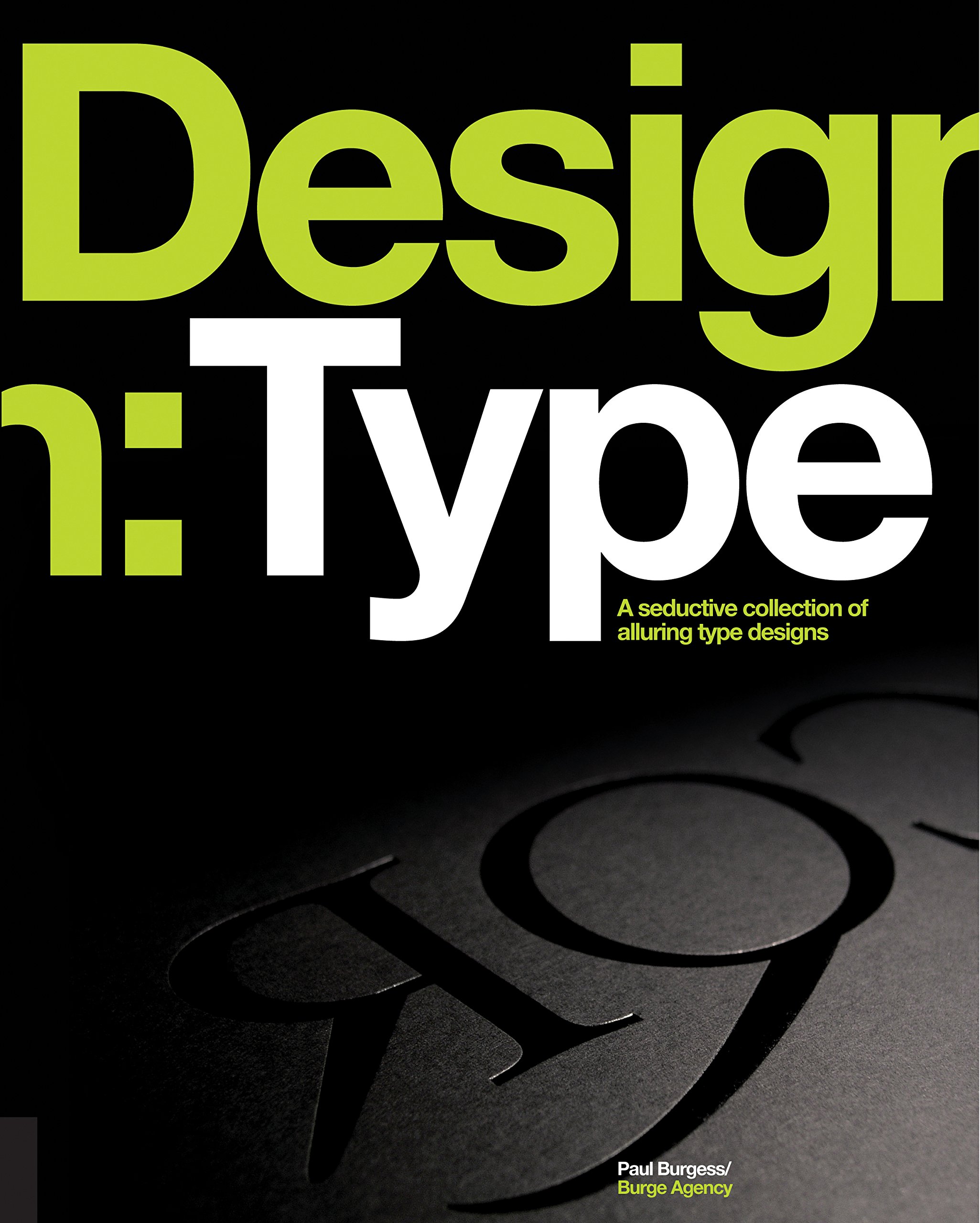
As a designer dealing with typography, working on editorial layouts for books and brochures can be improved on by doing less, in other words to make the design simpler. The old saying "Less is More" is true here but it is difficult as you're trying to make a layout say more by doing less.
For editorial design, Typographic hiearchy is one of the greatest assests available to designers wanting to make a navigation through a layout with minimum effort from the reader.
So what exactly is Typographic hiearchy?
Essentially, it is a system for organizing type that establishes an order of importance, which allows the reader to navigate and find what they are looking for with ease.
Typographic Design: Form and Communication by Rob Carter, Ben Day and Philip Maggs
17/04/2018 (Week 4)

Similar to the anatomy of typography, typographic syntax and communication is needed to understand typographic design.
What is Typographic Syntax? In grammar, the syntax is when words are combined to form phrases or sentences. Essentially, it is the connection of typographic signs to form words and sentences on the page. Starting with the basic unit. the following elements are used to make a cohesion through the use of typographic space, visual hierarchy, ABA space, and grid systems.
As seen in Fig 4.1, the composition shows contrasting visual characteristics between the letterforms. The 'T' being tall and thin, the 'E' being short and fat, and the 'P' having a balance of all characteristics. The composition was also arranged to enhance visual balance.
Through precise drawing of the letterforms and form to counterform interaction taken into consideration, two distinct letters were designed to form a cohesive sign. The part in black is the uppercase letter 'A' and within it as a counterform is the letter 'g'.
Design Writing Research - Writing on Graphic Design by Ellen Lupton and Abbott Miller
24/04/18 (Week 5)
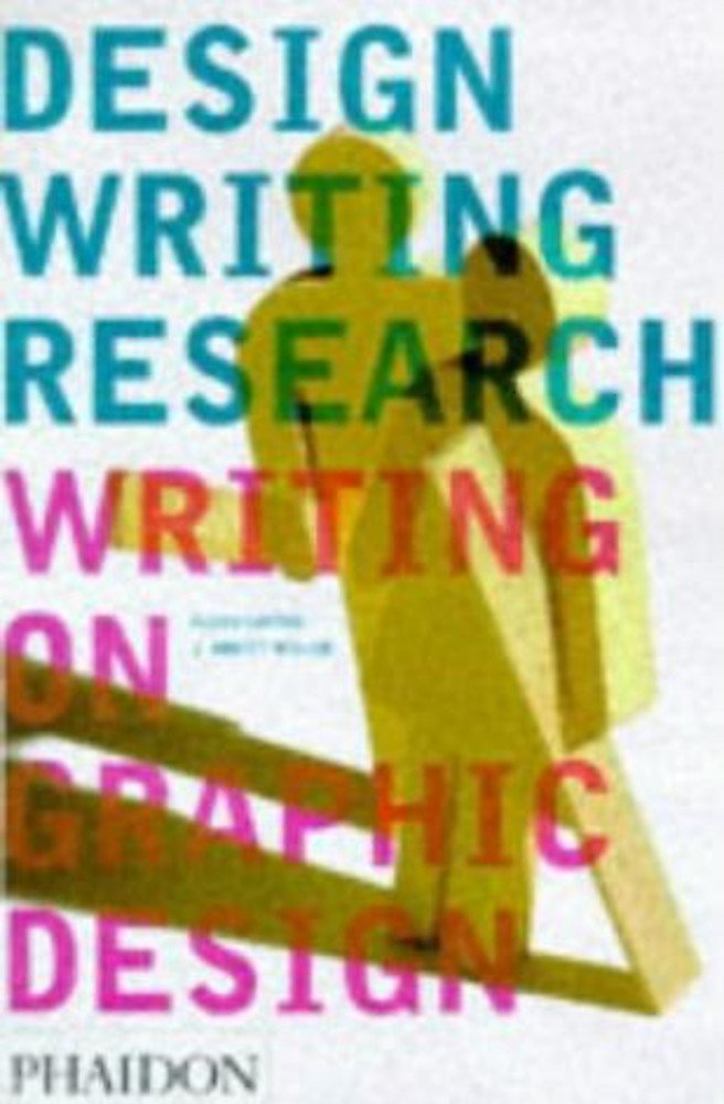

What sort of sign system is typography?
Is the history of letter forms a logical evolution towards perfect shapes, or is it because of our evolving philosophy, technology and social uses of writing? In modern typography, systematic relations of the body of the alphabet became the norm rather than the 'character' of individual letter forms.
Structuralism was created by the teachings of Ferdinand de Saussure in the early twentieth century. Saussure's theory of language infused many later currents of thought of other writers. Saussure attacked the assumption that language exists to represent ideas. Without language, the realm of potential human sounds is just a field of noise.
For Saussure, the linguistic sign was arbitrary, For example there is no resemblance between the sound horse and the concept of the horse. He says there is no link between the phonic aspect of the sign (the signifier) to the mental concept (the signified). Only a social agreement appears to hold these two elements together.
If there is no real link between these elements, why is it so reliable? Why is a horse called a horse?
Sauusure explains this link by introducing the principle of 'Linguistic Value'. The identity of signs rests not on the signs itself, but on its relation to other signs in the system. The sound horse is only recognizable in opposition to other English sounds, such as morse, force, bourse, house, etc. The concept of horse has identity only in opposition to other concepts, such as cow, antelope, pony etc. The meaning of the sign is generated from the surrounding system. Otherwise, the sign alone is empty.
Specimens of Printing Types and Ornaments by John Willis Clark
01/05/2018 (Week 6)
This book had a variety of collections of typefaces of several languages, ornaments, borders, and decorative devices used in books printed at Cambridge in 1900. This collection includes many historical typefaces that are used today such as Carlson and Miller. There are are also several interesting and detailed borders, corners and head and tail pieces, university and college shields, and even a catalog of the Egyptian hieroglyphics.
I also noticed when showcasing the typefaces the words "Pica" and "Great Primer" would often be used in the subtitles. Pica is typically used to represent fixed horizontal measurements but often used to represent column width and contains 12 points or is around 1/6th of an inch. Pica's are designated with the letter 'p', such as 18p. Great Primer is a large typeface size of 18 points which was often used in the printing of large format books such as English Bibles. It is also known as 'Bible Text' because of this. Some other typeface terms include:
Here are some interesting typefaces and designs from this historical collection:
Miller's typeface arranged in a unique way called 'Brilliant'. The letters are squished between two vertical lines to make it look like towers or skyscrapers.
REFERENCES
Ambrose, G., & Harris, P. (2005). Basics Design Typography. AVA Publishing.
Ambrose, Gavin, and Paul Harris. Basics Design Colour. AVA Publishing SA, 2005.
Burgess, P., & Seddon, T. (2012). Design/type: A seductive collection of alluring type designs. Gloucester, MA: Rockport.
Absolute & Relative Measurements. (n.d.). Retrieved April 2, 2018, from https://stodioo.com/articles/absolute-relative-measurements/
Lupton, E., & Miller, J. A. (2008). Design writing research: Writing on graphic design. London: Phaidon.
IMAGES
Friedlander, J. (2012, February 1). Book Design: Don’t Get Confused By Typeface Point Sizes. Retrieved April 2, 2018, from https://www.thebookdesigner.com/2012/02/book-design-dont-get-confused-by-typeface-point-sizes/
Typograhic Hierachies Project #2 [Digital image]. (n.d.). Retrieved April 16, 2018, from http://aic.design/project/typographic-hierarchies/
03/04/2018 (Week 2)
This week was all about using a calligraphy pen and practicing 3 types of strokes and choosing a hand to practice as well. After familiarizing ourselves with holding the pen and technique, we started with horizontal and vertical lines on graph paper, followed by circles. We then had to choose a hand to work on which are Blackletter, Foundational/round hand or Uncial. After choosing a hand we had to write the letters A-Z.
10/04/2018 (Week 3)
This week we learnt about the timeline and development of Typography. It was mentioned that most written work and books on typography are written from the western world.
In history, uppercase letters consist of lines and circles at its core. The earliest development of letter forms were called Phoenician. Phoenician was based on sounds things made. Phoenician was then evolved to what we know as Greek, which then developed into Roman. The Greeks were responsible for inventing 'Boustrophedon'. Lines of text were read alternatively from right to left, then left to right. Instead of spaces the Greeks used dots which is later used in punctuation like today.
Fast forwarding in time, typography developed to be revolved around 'square capitals'. This method of writing was slow and difficult to write. Later the compressed version of square capitals was used, known as 'rustic capitals'. Due to how compressed it was, the use of rustic capitals saved space on parchment, which also saved money. Parchment was the paper used back then, however things were written on animal skin. The writing tool required was easier to use than square capitals, however because they were compressed and saved space, it made it harder to read.
17/04/2018 (Week 4)
This week we did not have lecture as we used the time to show our work from the previous work for Mr Vinod and Mr Shamsul to review. We then proceeded to work on out next task which was to creating letter forms on of our names which represented one of our personalities. This was done on illustrator and we had to choose one that best fits our chosen personality. After that we proceeded to create a GIF using Photoshop that enhances the personality.
24/06/2018 (Week 5)
No lecture.
01/05/2018 (Week 6)
No lecture. Public Holiday.
INSTRUCTIONS
EXERCISE
Calligraphy (Week 1 - 3)
The first part of this weeks exercise was familiarizing myself with the calligraphy pen and developing proper technique to do the strokes. Fig 2.1 and 2.2 was on practice paper. I focused mainly on the circles as it was the most difficult for me.
 |
| Fig 2.1 - First time doing the strokes |
 |
| Fig 2.2 - Horizontal, vertical line, and circle practice. |
 |
| Fig 2.3 - Final version of strokes |
 |
| Fig 2.4 - Practicing the different hands |
 |
| Fig 2.5 - Uncial and Blackletter |
 |
| Fig 2.6 - Foundational hand reference |
 |
| Fig 2.7 - Practicing Foundational Lettering |
 |
| Fig 2.8 - Foundational Lettering (A-L) |
 |
| Fig 2.9 - Foundational Lettering (M-X) |
 |
| Fig 2.91 - Foundational Lettering (Y-Z) |
Week 3 - Quotes
This week we had to choose a quote to write out using the selected hand and lettering practice from last week. Fig 3.1 is me practicing writing the quote and trying to find the right composition and spacing.
 |
| Fig 3.1 Practicing Quotes |
 |
| Fig 3.2 - Final practice of quote |
 |
| Fig 3.3 - Final piece. |
 |
| Fig 4.1 - Type Expression rough draft |
After taking Mr Vinod's advice to make the outlines of the letters have gaps, I decided with using squiggly lines that aren't connected. This was done using the brush tool in Illustrator.
 |
| Fig 4.2 - Letter form of my name (Personality - Indecisive)
Mr Shamsul suggested that I only needed to use 2 frames/artboards to make the animation effective and enhance the type expression of indecisiveness.
|
 |
| Fig 4.3 - Using 2 art boards for animation |
 |
| Fig 4.4 - Animated letter form of name (Personality - Indecisive) |
 |
| Fig 4.5 - First attempt at type expression of 6 words |
| ' . |
| ' . |
 |
| Fig 4.6 - Final attempt at type expression of 6 words |
 |
| Fig 4.7 - Timeline of first attempt at type expression of 'Quick' |
 |
| Fig 4.8 - First Version of animated type expression 'Quick' |
 |
| Fig 4.9 - Final Version of animated type expression of 'Quick' |
FEEDBACK
Week 2
General Feedback: Today in class Mr Vinod explained how we should be working towards consistency rather than perfection with out strokes. The surface we are working on could have a slight impact on our strokes as well, so putting something flat under the graph paper will provide a smoother surface for smoother strokes.
Specific Feedback: Mr Vinod advised me on the angle of the pen and how it doesn't change at all no matter what stroke or hand is used. When he saw my horizontal and vertical lines, he said the ends of some of the lines were not slanted, meaning I held the pen close to a 90 degrees angle from the paper. To practice being consistent with the angle, I chose the Foundation hand as it is a good indicator to when my angles are off.
Week 3
General Feedback: Mr Vinod told the class to write our names in pencil on our work. When practicing on graph paper, he told us to draw two lines to make an 'X' to find the middle point. He also told us to be mindful of how much space there will be for a line of quote on the right side of the paper.
Specific Feedback: Mr Vinod told me my horizontal and vertical lines were good, aswell as my circles. However my letters were rated a 2/5. There is inconsistency with the size and placement of the letters on the line. For example the top of letter g should not start on the top half of the x height, instead it should start on the x height and pass through the baseline. For my lettering Mr Shamsul commented on my strokes and how it does not look like the foundation reference in terms of the width of the lines. Some of my S letters were done in one stroke, instead of 3. I seemed to also press too hard but this may be due to me using 2.0 instead of 3.0. I should also take my time and do the strokes slowly and precisely.
Week 4
General Feedback: Our name, student ID, and date should be written on the back of the artwork rather than the front. Our animations should reinforce our personality and it shouldn't be random or irrelevant.
General Feedback: Our name, student ID, and date should be written on the back of the artwork rather than the front. Our animations should reinforce our personality and it shouldn't be random or irrelevant.
Specific Feedback: Mr Vinod said my final submission of the quote on plain a4 was a good effort, however there are things that can be improved. He said it was a wise decision to use a smaller size for the lettering, but it can be improved by making the space in between the letters tighter and that the horizontal stroke on my capital T was done incorrectly. He also said some of the letters look blotted, which could be due to me applying too much force on the paper or the quality of paper itself. For the animated type expression for my name, Mr Shamsul suggested that I can use only 2 frames/artboards to make my squiggly outlines move. Mr Vinod said that the black sections around my letters should reinforce my personality instead of just looking better.
Week 5
General Feedback: Mr Vinod told us to reformat our blog. We need to follow the blog format and make it clear for the viewer what we want to convey. He also told us to rework and improve our type expressions if we want.
Specific Feedback: Mr Vinod said my 'drunk' type expression wasn't strong enough. The allignment and position of the letter D in my dead wasn't done properly, and the gradient in my 'loud' wasn't necessary. He said the rest of my words were fine. My quick animation was not quick enough so I have to make improvements.
Week 6
No feedback due to Labour day holiday.
Experiences:
Week 1 - This week was the first class, so it was just an overview and briefing of what is to come in the coming weeks. No activities/exercises were conducted apart from creating this blog.
Week 2 - This was a fun yet tedious exercise. Doing the same strokes for hours straight was mentally and physically draining but it was rewarding when my consistency and technique improved.
Week 3 - It was difficult to get the right position for the words of the quote and figuring out which letters should be written in a line. However it was good application of the lettering drills done last week.
Week 4 - It was enjoyable to use illustrator for a change rather than using pen and paper. It was interesting to make my first 'animation' of the semester.
Week 5 - It was challenging to come up with 6 type expressions and then choose the best one to animate. While it is challenging, it really makes me use my creativity and my knowledge on Illustrator.
Observation:
Week 1 - I noticed I had not taken any notes since before the holidays. My handwriting was a mess and my note taking was all over the place.
Week 2 - I noticed when I am holding the pen at a weird angle I end up compensating by pressing harder with the pen, which is damaging to the pen and the strokes. Each time the angle felt off I would get the feel for the right angle by practicing again on a different piece of paper.
Week 3 - While my technique and strokes have improved a lot, there was very little improvement in terms of my lettering looking like the foundation/round hand reference. The spacing and composition was there but the lettering was not quite right,
Week 4 - My classmates had very unique and interesting type expressions. I got a few ideas just by looking at what others had planned. I also noticed most people had started making many art boards for their animation while my type expression only needed 2.
Week 5 - I noticed that some of the type expressions from my classmates and myself were quite similar. There may be so much we can do without distorting the letters.
Findings:
Week 1 - My notes are easier to understand if I draw quick diagrams or mind maps when writing down a lot of information in a short amount of time.
Week 2 - Every time I became conscious of the angle I was holding my pen, I would usually mess up my stroke or readjust to the wrong angle. This made me realize that my strokes are more consistent if I don't think about it too much and press too hard on the paper by letting my hand go on the paper. I was trying too hard to replicate the lettering from the reference rather than improving on the consistency of my strokes.
Week 3 - I realized that using a 2.0 calligraphy pen made a big difference in how my lettering turned out. In order to compensate for my thinner pen my lettering size should be smaller. This would also improve the lettering as it easier to differentiate between the thinner and thicker strokes.
Week 4 - I noticed I'm not doing as much practice and work at home as much as some of my classmates. If I were to do more practice and higher quality draft work, it could result in a better final outcome.
Week 5 - If I'm going to produce quality work and get Mr Vinod's approval on my work, I'm going to have to take his advice properly and try my best to implement it.
FURTHER READING
BASICS DESIGN - TYPOGRAPHY by Gavin Ambrose and Paul Harris
27/3/18 (Week 1)
X-height
A method used as a layout anchor to produce consistent positioning of images and text blocks is called X-height. The term is applied when the distance between the baseline and the mean line of non-ascending or lower case letters. The reason 'x' is used is because it is flat at both the bottom and top. In short, the X-height is a relative measure specific to the typeface being set. The measurement of the typeface will be different for every typeface, even if the point size is the same.
 |
| 1.2 - X-height of 100 Point Impact Typeface |
Absolute and Relative measurements
Absolute measurements is simply the measurement of fixed values. A milliliter is a precisely defined increment of a centimeter where both points and picas which are basic typography measurements have fixed values. For instance, a 60 point typeface would form and fit on 5 grid lines, each being 12 points apart. The 60 point typeface will sit within these lines rather than being equal to the measurement. This point system was developed by Pierre Fournier and Francois Didot in the 19th century. The point size of a typeface is measured from the ascent line to the descent line, where the system was originally created for metal type.
Some typographical measurements are relative to the point size of the type being set. This relative measurement is commonly used to set dashes, fractions, and spacing. An 'Em' set in 60pt type is 60 points, and an em set in 70pt type is 70 points. An 'En' is half the size of an Em.
- Em is a unit of measurement that came from the width of the square body of an 'M'
- Em equals to the size of a given type.
- Em is used in paragraph indents and denoting nested clauses in North America,
- En is half the size of an Em.
- En is used in Europe to denote nested clauses.
- Hyphen is one third the length of an Em.
- Hyphen is used to separate compound words.
03/04/18 (Week 2)
An important design element that can be implemented with Typography is colour. Using the right colour will create the best impression when the audience looks at the types. It is crucial in websites and other media where first impression is everything. The simplest combination used is a neutral colour for the background and dark colour for the text. The Google search engine uses a plain white background and dark text.
 |
| Fig 2.1 - Google search engine with plain background |
Even a light colored text with a dark background can be used as well. A good example of a wesbite I used quite often is Twitch. They use a purple background with a white or lighter tone of purple for the text.

 |
| Fig 2.2 - Twitch dark background with light text |
11/04/18 (Week 3)
As a designer dealing with typography, working on editorial layouts for books and brochures can be improved on by doing less, in other words to make the design simpler. The old saying "Less is More" is true here but it is difficult as you're trying to make a layout say more by doing less.
For editorial design, Typographic hiearchy is one of the greatest assests available to designers wanting to make a navigation through a layout with minimum effort from the reader.
So what exactly is Typographic hiearchy?
Essentially, it is a system for organizing type that establishes an order of importance, which allows the reader to navigate and find what they are looking for with ease.
- One way to achieve this hierarchy is to use contrasting typeface families.
- To strive for simplicity, you should use contrasting weights from a well populated typeface.
- For body text, unless you 100% know you won't use it, never use a typeface that doesn't have at least a roman, semi-bold, and bold weight.
- Italics should also be an option too for emphasizing a name or product.
- Using a consistent set of geometric forms (the letterforms) makes it easier for the reader to scan the text and recognize the forms from one word to another.
- Our brain takes snapshots of a any one typeface and provides faster feedback when we see the same character shapes reoccurring.
 |
| Fig 3.1 - Typographic Hierarchy example |
17/04/2018 (Week 4)
Similar to the anatomy of typography, typographic syntax and communication is needed to understand typographic design.
What is Typographic Syntax? In grammar, the syntax is when words are combined to form phrases or sentences. Essentially, it is the connection of typographic signs to form words and sentences on the page. Starting with the basic unit. the following elements are used to make a cohesion through the use of typographic space, visual hierarchy, ABA space, and grid systems.
- Letters
- Words
- Collumn
- Margin
 |
| Fig 4.1 - 3 Lettforms composition by Robert Boyle |
 |
| Fig 4.2 - 2 Letteforms forming in cohesion by Gali Collins |
Design Writing Research - Writing on Graphic Design by Ellen Lupton and Abbott Miller
24/04/18 (Week 5)
What sort of sign system is typography?
Is the history of letter forms a logical evolution towards perfect shapes, or is it because of our evolving philosophy, technology and social uses of writing? In modern typography, systematic relations of the body of the alphabet became the norm rather than the 'character' of individual letter forms.
Structuralism was created by the teachings of Ferdinand de Saussure in the early twentieth century. Saussure's theory of language infused many later currents of thought of other writers. Saussure attacked the assumption that language exists to represent ideas. Without language, the realm of potential human sounds is just a field of noise.
For Saussure, the linguistic sign was arbitrary, For example there is no resemblance between the sound horse and the concept of the horse. He says there is no link between the phonic aspect of the sign (the signifier) to the mental concept (the signified). Only a social agreement appears to hold these two elements together.
If there is no real link between these elements, why is it so reliable? Why is a horse called a horse?
Sauusure explains this link by introducing the principle of 'Linguistic Value'. The identity of signs rests not on the signs itself, but on its relation to other signs in the system. The sound horse is only recognizable in opposition to other English sounds, such as morse, force, bourse, house, etc. The concept of horse has identity only in opposition to other concepts, such as cow, antelope, pony etc. The meaning of the sign is generated from the surrounding system. Otherwise, the sign alone is empty.
Specimens of Printing Types and Ornaments by John Willis Clark
01/05/2018 (Week 6)
This book had a variety of collections of typefaces of several languages, ornaments, borders, and decorative devices used in books printed at Cambridge in 1900. This collection includes many historical typefaces that are used today such as Carlson and Miller. There are are also several interesting and detailed borders, corners and head and tail pieces, university and college shields, and even a catalog of the Egyptian hieroglyphics.
I also noticed when showcasing the typefaces the words "Pica" and "Great Primer" would often be used in the subtitles. Pica is typically used to represent fixed horizontal measurements but often used to represent column width and contains 12 points or is around 1/6th of an inch. Pica's are designated with the letter 'p', such as 18p. Great Primer is a large typeface size of 18 points which was often used in the printing of large format books such as English Bibles. It is also known as 'Bible Text' because of this. Some other typeface terms include:
- Minion
- Emerald
- Nonpareil
- Ruby
- Small Pearl
- Diamond
- Diamond Pearl
- Hair-spaced
- Accented
- Brilliant
- Brevier
- Beza
Here are some interesting typefaces and designs from this historical collection:
 |
| Fig 6.1 - Modern Face Ruby (Miller) |
 |
| Fig 6.2 - Old Face Double Pica (Caslon) |
Miller's typeface arranged in a unique way called 'Brilliant'. The letters are squished between two vertical lines to make it look like towers or skyscrapers.
 |
| Fig 6.3 - Modern Face Brilliant (Miller) |
REFERENCES
Ambrose, G., & Harris, P. (2005). Basics Design Typography. AVA Publishing.
Ambrose, Gavin, and Paul Harris. Basics Design Colour. AVA Publishing SA, 2005.
Burgess, P., & Seddon, T. (2012). Design/type: A seductive collection of alluring type designs. Gloucester, MA: Rockport.
Absolute & Relative Measurements. (n.d.). Retrieved April 2, 2018, from https://stodioo.com/articles/absolute-relative-measurements/
Lupton, E., & Miller, J. A. (2008). Design writing research: Writing on graphic design. London: Phaidon.
Friedlander, J. (2012, February 1). Book Design: Don’t Get Confused By Typeface Point Sizes. Retrieved April 2, 2018, from https://www.thebookdesigner.com/2012/02/book-design-dont-get-confused-by-typeface-point-sizes/
Typograhic Hierachies Project #2 [Digital image]. (n.d.). Retrieved April 16, 2018, from http://aic.design/project/typographic-hierarchies/
Comments
Post a Comment