TYPOGRAPHY - PROJECT 1
08/05/18 - 15/05/18 (Week 7 - Week 8)
Mohamad Irfan Mohamad Zaim (0326620)
Typography
Project 1 - A Story Book
LECTURE
08/05/2018 (Week 7)
We first learnt about text tracking, which involves altering the Kerning and Letter-spacing. Kerning is often mistaken for letter-spacing, but Kerning refers to the automatic adjustment of space between letters. Letter-spacing is the addition of space between letters. 'Tracking' refers to the addition and removal of space between words or sentences. There are 3 types of tracking:
Project 1 - A Story Book (Week 7 - Week 8)
After making drastic changes to my first draft and following the rules and guidelines of the project, I completed my final design for the Babadook book.
Here are the thumbnails for every page.
FEEDBACK
Week 7
Specific Feedback: Mr Vinod said that my animated type expression was good and expresses the corresponding word. He said the same about my name type expression.
General Feedback: Mr Vinod said what seperates bad from good designers is attention to detail. He also said to be unique and creat our own style for the bababook assignment.
Week 8
Specific Feedback: Mr Vinod and Mr Shamshul said while I had flow throughout my spreads, they still had to be reworked in terms of composition, alignment, and tracking. I also had unnecessary black rectangles behind the text.
General Feedback: Mr Vinod said we didn't have to express every word in the sentence. We could only express 3-4 different words or sentences out of all the paragraphs we needed to include in the book.
REFLECTION
Experiences:
Week 7 - It was difficult to design the Babadook book. InDesign is also a software I am new to and find it very annoying and difficult to use at times. However learning the basics of InDesign is useful and feels rewarding that I can use Photoshop, Illustratorm and now InDesign.
Week 8 - I had to redesign my book drastically. While it was frustrating to change it so much, the saying 'less is more' suddenly became much more significant.
Observation:
Week 7 - From the examples of the book from previous semesters that Mr Vinod showed us, they all had a distinct and unique style, where it was using the type to emphasize on the sound the word makes, or directing the eyes of the viewer around the page.
Week 8 - Because we had to follow the rules and guidelines, we were limited to what we could put on a page. However, because of this limitation, everything we put on our spreads matter even more.
Findings:
Week 7 - I need to create my own style that makes use of kerning, letter-spacing, and the different typefaces on the different words and letters to get the best possible outcome.
Week 8 - Every kerning, every placement, every typesize, every detail matters when designing this book. I had to consider all this and the other design principles and it all had to contribute to making the design BETTER.
FURTHER READING
Just My Type by Simon Garfield
08/05/18 (Week 7)

Cooper black is the sort of font the oils in a lava lamp would form if smashed to the floor Simon describes. The creator of cooper black believed it ideal for far-sighted printers with near-sighted customers. There are little nicks at the tops and bases of the letters, and they give the font a solid flat weight on a page. Without them, the type would always appear to be rolling away.
A budget airline called easyJet adopted this type with the intent to a warm fuzziness and homeliness effect. The lettering on the sides of the plane had rarely impiled fun before Cooper black was used. Cooper black looks best from afar and easyJet capitlized on this. Before ending up on the side of a plane, it's most famous appearance was on the classic Beach Boys album Pet Sounds. While it was affective for the title om the CD cover, the weakness of the font showed on the smaller type of the song names. It was difficult to read and for the brain to unscramble the next line.
This is one difference between legibility and readability: at small sizes, Cooper Black is legible but not very readable. However, some types are meant to be 'seen' rather than 'read'. A study by Dr Javal in 1940 involved the the 'blink test'. Blinking relieves tired eyes just like how your palms feel relieved after putting down heavy grocery. Our eyes blink more when tired or under strain, just like how a familiar typeface will cause less fatigue. According to another study by John Biggs at the London college of printing, the types that fared best in the blink tests were those that had survived for centuries and were being revived and modified. Some examples are Bembo, Bodoni, and Garamond.
The conclusion that can be made from these studies is that people found type with strong distinctive strokes easier to read than flattened styles. This great distinction between letters ked to a clearer and faster digestion of information. The key areas that make a letter most distinctive are its top half and right side. Another study shows that most readers prefer bold faces over regular ones, although their legibility is about the same. Typefaces with larger counters, which is the opposite of what Cooper black is - are also regarded as more legible, especially at smaller sizes where these counters could fill with ink.
Texts on Type: Critical Writings on Typography. Edited by Steven Heller and Philip B. Meggs
15/05/08 (Week 8)
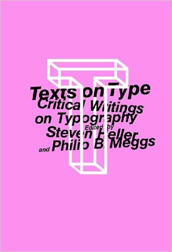
This book is a compilation of texts about the history, aesthetics, and practice of type design and typography. This chapter which I have read is the 'The principles of the New Typography' by Jan Tschichold.
The modern man has to absorb a mass of printed matter every day. At first, today's printing differed from the older times in terms of quantity rather than quality. However, as the quantity increased, so did the 'form'. The speed with which the modern consumer of printing has to absorb it means that the form of printing also must adapt itself for the modern day. We don't read quietly line by line, but glance quickly over the text as a whole. It's only if there is enough interest when we read line by line and study the details.
The old typography both in feeling and form was adapted to the needs of its readers, who had the time to read line by line in a leisurely manner. Function did not yet play a significant role. It was concerned less with 'beauty' or 'art.' Issues relating to formal aesthetics (type, mixture of typefaces, ornaments) dominated considerations of form. Now in this age it is out duty to achieve a lively focus on the issues of form and design. Form was considered something external, a product of 'artistic imagination. Nowadays we have moved closer to the recognition of its essence through the study of nature and especially technology. Both nature and technology teach us that 'form' is not independent, but grows out of function (purpose), out of the materials used (organic or technical), and how they are used.
The essence of the New Typography is clarity. The utmost clarity is necessary because of the claims for attention made by the extraordinary amount of print, which demands the greatest economy of expression.
REFERENCES
Garfield, S. (2011). Just My Type. Gotham Books.
Mohamad Irfan Mohamad Zaim (0326620)
Typography
Project 1 - A Story Book
LECTURE
08/05/2018 (Week 7)
We first learnt about text tracking, which involves altering the Kerning and Letter-spacing. Kerning is often mistaken for letter-spacing, but Kerning refers to the automatic adjustment of space between letters. Letter-spacing is the addition of space between letters. 'Tracking' refers to the addition and removal of space between words or sentences. There are 3 types of tracking:
- Normal Tracking
- Loose, larger kernings
- Tight, smaller kernings
The two most important factors in typography is 'readability' and 'legibility'. The viewer does not directly see the type, but we see the patterns formed by the type. These patterns are recognizable and distinguishable because of the different hints different types have. Uppercase letters do not have many hints, therefore they need more letter-space.
When there is a large body of text such as paragraphs, there are different formats that can be used. Flush means that that side of the paragraph are vertically aligned at the start of each line. Ragged meaning there is uneven alignment at that side of the paragraph. The different formats are:
When there is a large body of text such as paragraphs, there are different formats that can be used. Flush means that that side of the paragraph are vertically aligned at the start of each line. Ragged meaning there is uneven alignment at that side of the paragraph. The different formats are:
- Flush Left, Ragged Right (Closely mirrors asymmetrical experience of handwriting)
- Centered (Imposes symmetry upon the text, equal value and weight to both ends of any line, should not be used for 6-7 lines of text)
- Flush Right, Ragged Left (End of each line is symmetrical)
- Justified (Imposes symmetrical shape on text, done by expanding and reducing space between word and letters. As a result 'Rivers' are created which is random kerning/letter-spacing throughout the paragraph/
- Type that calls attention to itself before the reader can get to the words is called 'interference'.
- Larger x-height creates a darker mass on the type
- Longer lines can be bad, it can be hard on the reader, and can sometimes create confusion on which line to start on next.
15/05/2018 (Week 8)
This week we learnt about paragraphs and the different formats and ways to design paragraphs.
Pilcrow (¶) indicates a new paragraph or section of text. It is a holdover from medieval manuscripts and is seldom used today.
Leadings are the space between the baselines of two lines of text. Not to be confused with line spacing which is vertical distance between lines of text. These terms are based of the letterpress.
Indentations are a gap at the beginning of a text to separate paragraphs and to minimize the cost of papers in the past. If indentation is used, justification should be used as well.
Widow is a short line of text left at the end of a paragraph and Orphans are short lines of text at the start.
Highlighting text to differentiate a paragraph from another is by
- Adjusting x-height with different point size
- Placing colour at back of text
- Colour coding
- Using bold
Quotation marks can also be used for paragraphs of text.
Heads and subheads can be used to indicate a new topic within a section. There are different ways to make the head. For example by making the point size of the head larger than the body text. Using bold and all caps can be used as well. The main ways to make a headline within a text is by
- C head (embedded in the paragraph
- Small capitals
- Larger point size
Cross alignment is having two paragraphs side by side with space in between. When using cross alignment the leading must be the same or divisible by a common number. If one paragraph uses a leading of 5, then the aligned paragraph can use 5, 10, 15, etc. Some lines will be aligned but not all.
INSTRUCTIONS
Project 1 - A Story Book (Week 7 - Week 8)
For our first project in typography, we were tasked to design a book and cover using sentences from the book 'Mr.Babadook'. We had to use Adobe InDesign and could not distort the words or letters. We could only choose one typeface family to use but the typefaces were up to us. We do not have to express every single word but only the words that are necessary. When deciding on typeface, type size, composition, kerning, letter-spacing, and tracking, we had to keep in mind of the design principles. The design principles which are contrast, allignment, hiearchy, emphasis, and balance, are used as a guideline for successful and effective design for our spreads. This is my first draft of the Babadook story book:
 |
| Fig 1.1 - Cover Page of Babadook Book (First Draft) |
 |
| Fig 1.2 - First Draft Page 2 and 3 |
 |
| Fig 1.3 - First Draft Page 4-5 |
 |
| Fig 1.4 - First Draft Page 6-7 |
 |
| Fig 1.5 - First Draft Page 8 |
After making drastic changes to my first draft and following the rules and guidelines of the project, I completed my final design for the Babadook book.
 |
| Fig 2.1 - Final Design Cover Page |
 |
| Fig 2.2 - Final Design Page 2-3 |
 |
| Fig 2.3 - Final Design Page 4-5 |
 |
| Fig 2.4 - Final Design Page 6-7 |
 |
| Fig 2.5 - Final Design Page 8 |
Here are the thumbnails for every page.
 |
| Fig 3.1 - Thumbnails of Mr Babadook |
Fig 4.1 - Mr Babadook Embedded PDF
 |
| Fig 4.2 - Front cover of hardcopy book |
 |
| Fig 4.3 - Page 2 and 3 |
 |
| Fig 4.4 - Page 4 and 5 |
 |
| Fig 4.5 - Page 6 and 7 |
 |
| Fig 4.6 - Last page |
FEEDBACK
Week 7
Specific Feedback: Mr Vinod said that my animated type expression was good and expresses the corresponding word. He said the same about my name type expression.
General Feedback: Mr Vinod said what seperates bad from good designers is attention to detail. He also said to be unique and creat our own style for the bababook assignment.
Week 8
Specific Feedback: Mr Vinod and Mr Shamshul said while I had flow throughout my spreads, they still had to be reworked in terms of composition, alignment, and tracking. I also had unnecessary black rectangles behind the text.
General Feedback: Mr Vinod said we didn't have to express every word in the sentence. We could only express 3-4 different words or sentences out of all the paragraphs we needed to include in the book.
REFLECTION
Experiences:
Week 7 - It was difficult to design the Babadook book. InDesign is also a software I am new to and find it very annoying and difficult to use at times. However learning the basics of InDesign is useful and feels rewarding that I can use Photoshop, Illustratorm and now InDesign.
Week 8 - I had to redesign my book drastically. While it was frustrating to change it so much, the saying 'less is more' suddenly became much more significant.
Observation:
Week 7 - From the examples of the book from previous semesters that Mr Vinod showed us, they all had a distinct and unique style, where it was using the type to emphasize on the sound the word makes, or directing the eyes of the viewer around the page.
Week 8 - Because we had to follow the rules and guidelines, we were limited to what we could put on a page. However, because of this limitation, everything we put on our spreads matter even more.
Findings:
Week 7 - I need to create my own style that makes use of kerning, letter-spacing, and the different typefaces on the different words and letters to get the best possible outcome.
Week 8 - Every kerning, every placement, every typesize, every detail matters when designing this book. I had to consider all this and the other design principles and it all had to contribute to making the design BETTER.
Just My Type by Simon Garfield
08/05/18 (Week 7)
Cooper black is the sort of font the oils in a lava lamp would form if smashed to the floor Simon describes. The creator of cooper black believed it ideal for far-sighted printers with near-sighted customers. There are little nicks at the tops and bases of the letters, and they give the font a solid flat weight on a page. Without them, the type would always appear to be rolling away.
A budget airline called easyJet adopted this type with the intent to a warm fuzziness and homeliness effect. The lettering on the sides of the plane had rarely impiled fun before Cooper black was used. Cooper black looks best from afar and easyJet capitlized on this. Before ending up on the side of a plane, it's most famous appearance was on the classic Beach Boys album Pet Sounds. While it was affective for the title om the CD cover, the weakness of the font showed on the smaller type of the song names. It was difficult to read and for the brain to unscramble the next line.
 |
| Fig 1.1 - easyJet using the Cooper Black type |
This is one difference between legibility and readability: at small sizes, Cooper Black is legible but not very readable. However, some types are meant to be 'seen' rather than 'read'. A study by Dr Javal in 1940 involved the the 'blink test'. Blinking relieves tired eyes just like how your palms feel relieved after putting down heavy grocery. Our eyes blink more when tired or under strain, just like how a familiar typeface will cause less fatigue. According to another study by John Biggs at the London college of printing, the types that fared best in the blink tests were those that had survived for centuries and were being revived and modified. Some examples are Bembo, Bodoni, and Garamond.
The conclusion that can be made from these studies is that people found type with strong distinctive strokes easier to read than flattened styles. This great distinction between letters ked to a clearer and faster digestion of information. The key areas that make a letter most distinctive are its top half and right side. Another study shows that most readers prefer bold faces over regular ones, although their legibility is about the same. Typefaces with larger counters, which is the opposite of what Cooper black is - are also regarded as more legible, especially at smaller sizes where these counters could fill with ink.
Texts on Type: Critical Writings on Typography. Edited by Steven Heller and Philip B. Meggs
15/05/08 (Week 8)
This book is a compilation of texts about the history, aesthetics, and practice of type design and typography. This chapter which I have read is the 'The principles of the New Typography' by Jan Tschichold.
The modern man has to absorb a mass of printed matter every day. At first, today's printing differed from the older times in terms of quantity rather than quality. However, as the quantity increased, so did the 'form'. The speed with which the modern consumer of printing has to absorb it means that the form of printing also must adapt itself for the modern day. We don't read quietly line by line, but glance quickly over the text as a whole. It's only if there is enough interest when we read line by line and study the details.
The old typography both in feeling and form was adapted to the needs of its readers, who had the time to read line by line in a leisurely manner. Function did not yet play a significant role. It was concerned less with 'beauty' or 'art.' Issues relating to formal aesthetics (type, mixture of typefaces, ornaments) dominated considerations of form. Now in this age it is out duty to achieve a lively focus on the issues of form and design. Form was considered something external, a product of 'artistic imagination. Nowadays we have moved closer to the recognition of its essence through the study of nature and especially technology. Both nature and technology teach us that 'form' is not independent, but grows out of function (purpose), out of the materials used (organic or technical), and how they are used.
The essence of the New Typography is clarity. The utmost clarity is necessary because of the claims for attention made by the extraordinary amount of print, which demands the greatest economy of expression.
REFERENCES
Garfield, S. (2011). Just My Type. Gotham Books.
Comments
Post a Comment