ADVANCED TYPOGRAPHY - FINAL PROJECT
Week 9 - Week 13 (22/10/18 - 19/11/10)
Mohamad Irfan Mohamad Zaim (0326620)
Advanced Typography
Final Project - Design, Exploration & Application
LECTURE NOTES
Week 9 (22/10/18)
This weeks lecture was presented by Nadia, May, Avy, Johann, and Allen. This lecture was about Typographic Perception and organization. They covered an interesting topic which was Gestalt Psychology laws and more basic points such as how to create visual hierarchy.
Week 10 (29/10/18)
This weeks lecture slides were conducted by Jennifer, Linda, Velia, Kitty, and Xiao Shi. They talked about Static and Kinetic Typography and Pyrography which is typography from the 4th century applied on wood by hand.
Week 12 (12/11/18)
This weeks lecture was conducted by all the groups in the class excluding the group from the previous week. This weeks lecture was centered around colour in typography and different groups had different topics to present such as colour in print, colour in signs, colour in posters, and the meaning of the colours.
INSTRUCTIONS
Final Project - Week 10
We were briefed on what the final project is all about based on the Module Outline by Mr Vinod. We were given too options regarding what we could do and the outcome of the final project.
1. Design a typeface that aims to solve a bigger problem or part of the solution in an area of interest.
2. Adding value to an existing typeface.
I quickly knew that I wanted to do something related to my area of interest whether it was option 1 or 2. I decided that I wanted my final project to be related to Japanese animation (anime). I decided to do research on typography in anime and find problems that I could potentially solve or add value to.
I looked at the typefaces used for subtitles from the top anime streaming sites which are Crunchyroll and Funimation. The first 3 are used in Crunchyrolls subs and the last one is used in Funimation subs.
I also realized that some typefaces are only used for specific anime. The typeface below is used exclusively for long running anime's such as Hunter x Hunter and One Piece.

I found the typefaces used and found that Open Sans and Bear Sophia which is used by Crunchyroll is a free font that can be downloaded online. Avenir used by Funimation can also be installed for free.
I looked into Netflix as they also stream anime. The subtitles used in Netflix can actually be customized so the user has the freedom of preference. However, while not publicly specified by Netflix, the default font used could be Helvetica or Times New Roman.
I asked my classmates, both people who watch and don't watch anime, to choose the typeface they prefer, Funimation or Crunchyroll. Everyone chose the Funimation typeface, while a few commented they did not mind the Crunchyroll.
I came to conclusion that the Funimation typeface, which is bolder and more readable is also more pleasing to look at. It is more readable compared to Open Sans which has thinner strokes and possibly a thinner outline. This also made me realize that all modern anime subs use a white fill with black outlines. The font-size and positioning on the screen is also different between the two typefaces. From this research I decided to design a typeface based on Open Sans with improvements to enhance its readability and attractiveness.
Week 11 (5/11/18)
I started by finding the X-height, cap height, ascender, and descender which is done by making x, p, d and, H on the same plane. After that I moved on to refining the letters.

Week 12 (12/ 11/18)
Mr Vinod said that I need to start from scratch. I should not use complex shapes like I have done with my g. The readability is not good enough so I designed a new typeface from scratch based on Avenir Black used by Funimation. This time I decided to use thicker strokes, and experiment with different outlines. Mr Vinod mentioned that I am designing an outline typeface, not a regular typeface which will just be used in black and no outline. I also wanted to add some fun to the letters by not making them entirely clean or geometric but a little quirky and round.
Week 13 (19/11/18)
Based on the feedback given by Mr Vinod and Mr Shamsul, I had to design another typeface. The previous attempt had strokes that were too thick and still did not solve the readability problem. Mr Vinod suggested to colour in the counters and holes in the letters black. The outline does not have to be too thick and I wanted to focus on making the letters more readable on different background with different tones, colours, and brightness.


I tried my typeface on different anime scenes with different art styles, quality, colours, and lighting:
FEEDBACK
Week 10
Specific Feedback: My final project idea was approved by Mr Vinod and tackles an interesting issue. I need to develop the letters A-Z, lower case or upper case. I need to think about what needs to be changed for the typeface and how it can be improved from what it is now.
Week 12
General Feedback: When working with colour in text with a background we should see how it looks in grayscale as well. For example yellow can appear different when seen in grayscale so adjustments to the tone can be made accordingly to improve readability and contrast.
Specific Feedback: I need to design an outline typeface, and start from scratch. The letters should be easy to read as they are subtitles, so I should not use complex shapes as I have done with my lowercase g. I should test my typeface on example anime backgrounds before proceeding.
Week 13
General Feedback: Write a short description under lecture slides. Minimum 3 sentences or more is acceptable. For processes, it is better to use JPG images rather than a PDF. The final artwork should be uploaded with JPG and PDF on the blog. For further reading there should be an image of the book cover and a screen grab for any websites used followed by the description of what was read.
Specific Feedback: My outline typeface is still too thick. The angles in-between the outines of the stoke have to be more promanent. Mr Vinod suggested to colour in the counters and holes black, as it is solving the readability issue in anime subtitles.
REFLECTION
Experiences:
Week 10: We are given so much freedom but at the same we are encouraged to choose something we want to do. I already know for a final project like this one I'm choosing something I have a lot of passion for.
Week 12: Designing a typeface from scratch is really difficult. After designing the x for the x-height it only becomes tedious and time consuming from then on.
Week 13: After a lot of trial and error I feel like the worse is over and it is now down to perfecting my final version of the typeface.
Observations:
Week 10: I noticed a lot of my classmates are opting to go for option 2, which is more focused on exploration and adding on to an existing typeface. Option 1 does seem less fun and more work.
Week 12: My classmates have great ideas but are not solving the issue or have found a real issue that needs solving with typefaces. This gave me ideas on how I should be approaching my own project and solve the real issue with anime subtitles: readability.
Week 13: My speed and productivity on Illustrator has improved a lot. Developing letters one by one are still very tedious but it is a lot easier than it was 2 weeks ago. The letters that I found the hardest to design actually became the more enjoyable ones to do.
Findings:
Week 10: After spending the week to do research I found a really cool idea which is to design a new typeface for anime subtitles or improve and existing one. Even though I am so used to the subtitle typefaces being used nowadays I feel I can bring something new to the table.
Week 12: After designing 2 typefaces I've come to learn from my mistakes and how to improve the readability of the letters. I need to focus on enhancing the readability of the letters and making sure it looks good on different backgrounds and anime scenes. Thicker strokes are better for headlines and should not be used for subtitles where people are constantly having to read and watch the anime at the same time.
Week 13: This last week is all about iterating my letters one by one. With guidance from Mr Vinod and Mr Shamsul I am coming closer to producing a solution to the readability in anime subtitles. It is a very unique approach and design and did not expect my letters to look this way from the start but it may work and look good as well.
FURTHER READING
The Fundamentals of Typography: Second Edition
Week 10

Dividing the Page
A grid on a page is the structure in which the various elements on the page are organized. It allows a degree of continuity to be maintained from page to page and chapter to chapter, it helps the reader access and digest information.
The classic Renaissance layout (later reinterpreted as the Golden canon by Jan Tschihold) is based on a page size with ratio 2:3. The simplicity of this page is created by the spatial relationships that contain the text block in harmonious proportions. This grid is dependent on proportions rather than measurements, which gives it it's own beauty. This grid is based on traditional book designs and will not work for all print jobs. Raul Rosarivo in one of his books seeked to find out how the Golden sections and 'hidden numbers' were used in the proportions of books. These numbers and layouts seek to establish a harmonious layout through the use of the golden section.
The spine (A) and head margin (B) positioned as a ninth of the page.
The inner margin (C) is half the size of the outer margin (D).
The height of the text block (E) is equal to the width of the page (F).
I find it interesting that such a renowned layout used for books does not focus on the mathematical measurements but makes use of these hidden numbers which are in truth all about utilizing ratios.
Typography Essentials: 100 Design Principles for Working with Type
Week 11
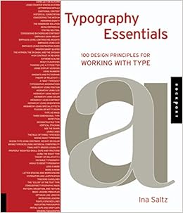
Considering the Medium
How and where the letterforms appear should be a clue to the designer's typographic decisions. Depending on the medium may decide what constitutes a more legible type choice. Is the text on a reflective surface such as paper, billboard, environmental signage, or a light-emitting surface such as a computer screen, video screen, or a rear-projection?
If the medium is a reflective surface, is it designed to be viewed primarily held in the hand, so that the distance is between the surface and the eye is a typical reading distance, or is it intended to be viewed from a distance, and if so what is this distance? Is the intended reader young, old, or visually impaired. For visually impaired readers, a typeface with a larger x-height and more open counter spaces would be more suited as highly legible typefaces. Is the surface glossy or matte? Glossier surfaces can have reflective light interfere with reading, so the typeface used might need to be larger and have higher legibility characteristics.
A glowing effect is produced from light emitting mediums such as screens. Letter-forms on these screens would have to be sturdier and to have a bit more tracking applied to counteract the effects of the glow for optimum readability. As with reflective surfaces, the distance at which you intent the text to be viewed should be a factor in the type choice, as well as the color, contrast with the background, size, and weight.
For mediums with moving type, it may be moving in a countless number of ways, zooming in and out, fading in and out, flashing on and off, moving from one place to another, breaking up, reassembling, and so on. Timing is more important here than in the previous mediums mentioned.
Design Elements: A Graphic Style Manual
Week 12

Hue Relationships
This particular chapter discusses the relationship between two colours used together with different hues. Designers can create interaction between different hues, independent of their saturation or value, according to where they lie on the colour wheel. The closer these colours are together on the wheel, the more similar their optical qualities which is what makes them harmonious. The farther they are on the colour wheel the more these optical qualities contrast.
With a yellow-orange background is complementary to blue-violet images and is analogous to the two colours wrapped around the central figure.
Analogous - Basically colours that are adjacent to each other on the colour wheel are analogous. While the colours are noticeably different from each other, the relationship is more about the temperature difference.
Complementary - Two colours appearing opposite each other on the colour wheel are complements of each other. Their mixture results in a neutral tone. With light, the neutral is a medium gray and with ink, it's a dull brown.
Triadic - Can also be referred to as 'split complements', a color triad involves 3 colours at 120 degree intervals from each other on the colour wheel. One colour is complementing two colours equidistant from its true complement.
Lessons in Typography by Jim Krause
Week 13

Exploring Fonts
This chapter focuses on exploring fonts and how to choose the right one for your project whether it is a logo or word-graphic related project. The first thing you should do is write out the words you will be working with on different line breaks. What this does is it gives a quick set of reminders on how your words might be presented as you begin considering font choices, type sizes, and line breaks.
If pairing a typeface that is thinner with a bolder and wider font, you can quickly figure this out or narrow down your options by taking a look at your handwritten word-configurations to see which ones seem best able to allow for the fonts' different proportions. Doing this will speed up the search for both a font and a compositional arrangement for the logo or word-graphic you are making.
Try out the words on a software, and in 3 different cases configurations: initial cap, lowercase, and uppercase. Place the words within oversized bounding boxes that will allow the letters to get bigger or smaller, depending on which font is applied to them in the next step.
Lastly copy the 3 words and use different typefaces on them, keep all potential fonts in the document, the ones that just don't fit should be deleted. Arrange it so that it is organized and simple to place a logo around it or however you decide to make the logo.
Mohamad Irfan Mohamad Zaim (0326620)
Advanced Typography
Final Project - Design, Exploration & Application
LECTURE NOTES
Week 9 (22/10/18)
This weeks lecture was presented by Nadia, May, Avy, Johann, and Allen. This lecture was about Typographic Perception and organization. They covered an interesting topic which was Gestalt Psychology laws and more basic points such as how to create visual hierarchy.
Week 10 (29/10/18)
This weeks lecture slides were conducted by Jennifer, Linda, Velia, Kitty, and Xiao Shi. They talked about Static and Kinetic Typography and Pyrography which is typography from the 4th century applied on wood by hand.
Week 12 (12/11/18)
This weeks lecture was conducted by all the groups in the class excluding the group from the previous week. This weeks lecture was centered around colour in typography and different groups had different topics to present such as colour in print, colour in signs, colour in posters, and the meaning of the colours.
INSTRUCTIONS
Final Project - Week 10
We were briefed on what the final project is all about based on the Module Outline by Mr Vinod. We were given too options regarding what we could do and the outcome of the final project.
1. Design a typeface that aims to solve a bigger problem or part of the solution in an area of interest.
2. Adding value to an existing typeface.
I quickly knew that I wanted to do something related to my area of interest whether it was option 1 or 2. I decided that I wanted my final project to be related to Japanese animation (anime). I decided to do research on typography in anime and find problems that I could potentially solve or add value to.
I looked at the typefaces used for subtitles from the top anime streaming sites which are Crunchyroll and Funimation. The first 3 are used in Crunchyrolls subs and the last one is used in Funimation subs.
 |
| Fig 1.1 - Funimation and Crunchyroll subtitle typefaces |
 |
| Fig 1.2 - Exclusive typeface used for some subtitles |
 |
| Fig 1.3 - Typeface used by Funimation (Avenir Medium) |

 |
| Fig 1.4 - Typeface used by Crunchyroll (Open Sans and Bear Sophia) |
I found the typefaces used and found that Open Sans and Bear Sophia which is used by Crunchyroll is a free font that can be downloaded online. Avenir used by Funimation can also be installed for free.
I looked into Netflix as they also stream anime. The subtitles used in Netflix can actually be customized so the user has the freedom of preference. However, while not publicly specified by Netflix, the default font used could be Helvetica or Times New Roman.
 |
| Fig 1.5 - Netflix Subtitles |
 |
| Fig 1.6 - Subtitle customization on Netflix |
 |
| Fig 1.7 - Anime using Funimation subs |
 |
| Fig 1.8 - Anime using Crunchyroll Subs |
 |
| Fig 1.9 - Anime using Crunchyroll Subs #2 |
Week 11 (5/11/18)
I started by finding the X-height, cap height, ascender, and descender which is done by making x, p, d and, H on the same plane. After that I moved on to refining the letters.
 |
| xpdH to find values |
 |
| Placing "a" next to x for x-height |
 |
| Refined forms for xpdH |
 |
| Process of changing to white fill and black outline |
 |
| Making more changes to xpdH (size of strokes with outlines) |
 |
| Completed a-z |
 |
| Confirming the values of descender, ascender, x-height, and cap height to put into FontLab |
 |
| Positioning letter on page for FontLab |
 |
| Keying in the values in FontLab |
 |
| Positioning letter on FontLabs |
 |
| Exported all the letters successfully into FontLabs |
Mr Vinod said that I need to start from scratch. I should not use complex shapes like I have done with my g. The readability is not good enough so I designed a new typeface from scratch based on Avenir Black used by Funimation. This time I decided to use thicker strokes, and experiment with different outlines. Mr Vinod mentioned that I am designing an outline typeface, not a regular typeface which will just be used in black and no outline. I also wanted to add some fun to the letters by not making them entirely clean or geometric but a little quirky and round.
 |
| Constructing the "x" for second typeface |
 |
| Finalized "x" |
 |
| Finished xpdh |
 |
| Resizing and positioning to fit for x-height and other values |
 |
| Process of designing remaining letters |
 |
| Finished letters |
As advised by Mr Vinod I should test the typeface by placing them on actual anime scenes to see how they look. I used a darker, lighter, and an in-between brightness background to test the typeface. I replicated the positioning and font-size from the Funimation subs. I decided to see if different outline sizes would make any significant changes and improvements in readability.
 |
| One of the chosen backgrounds |
 |
| Manually copying the letters and resizing and positioning |
 |
| Using rulers to guide where to place letters |
 |
| Top Row: 10pt outline on letters Bottom Row: 15pt outline on letters |
Based on the feedback given by Mr Vinod and Mr Shamsul, I had to design another typeface. The previous attempt had strokes that were too thick and still did not solve the readability problem. Mr Vinod suggested to colour in the counters and holes in the letters black. The outline does not have to be too thick and I wanted to focus on making the letters more readable on different background with different tones, colours, and brightness.
 |
| xpd completed, not doing "H" as the cap height is not needed. |
 |
| Completing letters by reusing elements but maintaining the theme and black counters |

  |
| Process of iteration |
 |
| Completed letters |
Next I found positioning of the subtitles on the screen by taking an anime scene with Funimation subtitles.
 |
| Using rulers to find positioning and size of subtitles on the screen |
 |
| Measured values |
 |
| Finding word spacing |
 |
| Using my typeface |
 |
| Comparison |
 |
| Scene #1 |
 |
| Scene #2 |
 |
| Scene #3 |
 |
| Scene #4 |
 |
| Scene #5 |
FEEDBACK
Week 10
Specific Feedback: My final project idea was approved by Mr Vinod and tackles an interesting issue. I need to develop the letters A-Z, lower case or upper case. I need to think about what needs to be changed for the typeface and how it can be improved from what it is now.
Week 12
General Feedback: When working with colour in text with a background we should see how it looks in grayscale as well. For example yellow can appear different when seen in grayscale so adjustments to the tone can be made accordingly to improve readability and contrast.
Specific Feedback: I need to design an outline typeface, and start from scratch. The letters should be easy to read as they are subtitles, so I should not use complex shapes as I have done with my lowercase g. I should test my typeface on example anime backgrounds before proceeding.
Week 13
General Feedback: Write a short description under lecture slides. Minimum 3 sentences or more is acceptable. For processes, it is better to use JPG images rather than a PDF. The final artwork should be uploaded with JPG and PDF on the blog. For further reading there should be an image of the book cover and a screen grab for any websites used followed by the description of what was read.
Specific Feedback: My outline typeface is still too thick. The angles in-between the outines of the stoke have to be more promanent. Mr Vinod suggested to colour in the counters and holes black, as it is solving the readability issue in anime subtitles.
REFLECTION
Experiences:
Week 10: We are given so much freedom but at the same we are encouraged to choose something we want to do. I already know for a final project like this one I'm choosing something I have a lot of passion for.
Week 12: Designing a typeface from scratch is really difficult. After designing the x for the x-height it only becomes tedious and time consuming from then on.
Week 13: After a lot of trial and error I feel like the worse is over and it is now down to perfecting my final version of the typeface.
Observations:
Week 10: I noticed a lot of my classmates are opting to go for option 2, which is more focused on exploration and adding on to an existing typeface. Option 1 does seem less fun and more work.
Week 12: My classmates have great ideas but are not solving the issue or have found a real issue that needs solving with typefaces. This gave me ideas on how I should be approaching my own project and solve the real issue with anime subtitles: readability.
Week 13: My speed and productivity on Illustrator has improved a lot. Developing letters one by one are still very tedious but it is a lot easier than it was 2 weeks ago. The letters that I found the hardest to design actually became the more enjoyable ones to do.
Findings:
Week 10: After spending the week to do research I found a really cool idea which is to design a new typeface for anime subtitles or improve and existing one. Even though I am so used to the subtitle typefaces being used nowadays I feel I can bring something new to the table.
Week 12: After designing 2 typefaces I've come to learn from my mistakes and how to improve the readability of the letters. I need to focus on enhancing the readability of the letters and making sure it looks good on different backgrounds and anime scenes. Thicker strokes are better for headlines and should not be used for subtitles where people are constantly having to read and watch the anime at the same time.
Week 13: This last week is all about iterating my letters one by one. With guidance from Mr Vinod and Mr Shamsul I am coming closer to producing a solution to the readability in anime subtitles. It is a very unique approach and design and did not expect my letters to look this way from the start but it may work and look good as well.
FURTHER READING
The Fundamentals of Typography: Second Edition
Week 10
Dividing the Page
A grid on a page is the structure in which the various elements on the page are organized. It allows a degree of continuity to be maintained from page to page and chapter to chapter, it helps the reader access and digest information.
The classic Renaissance layout (later reinterpreted as the Golden canon by Jan Tschihold) is based on a page size with ratio 2:3. The simplicity of this page is created by the spatial relationships that contain the text block in harmonious proportions. This grid is dependent on proportions rather than measurements, which gives it it's own beauty. This grid is based on traditional book designs and will not work for all print jobs. Raul Rosarivo in one of his books seeked to find out how the Golden sections and 'hidden numbers' were used in the proportions of books. These numbers and layouts seek to establish a harmonious layout through the use of the golden section.
 |
| Fig - Van de Graaf Canon layout |
The inner margin (C) is half the size of the outer margin (D).
The height of the text block (E) is equal to the width of the page (F).
I find it interesting that such a renowned layout used for books does not focus on the mathematical measurements but makes use of these hidden numbers which are in truth all about utilizing ratios.
Typography Essentials: 100 Design Principles for Working with Type
Week 11
Considering the Medium
How and where the letterforms appear should be a clue to the designer's typographic decisions. Depending on the medium may decide what constitutes a more legible type choice. Is the text on a reflective surface such as paper, billboard, environmental signage, or a light-emitting surface such as a computer screen, video screen, or a rear-projection?
If the medium is a reflective surface, is it designed to be viewed primarily held in the hand, so that the distance is between the surface and the eye is a typical reading distance, or is it intended to be viewed from a distance, and if so what is this distance? Is the intended reader young, old, or visually impaired. For visually impaired readers, a typeface with a larger x-height and more open counter spaces would be more suited as highly legible typefaces. Is the surface glossy or matte? Glossier surfaces can have reflective light interfere with reading, so the typeface used might need to be larger and have higher legibility characteristics.
A glowing effect is produced from light emitting mediums such as screens. Letter-forms on these screens would have to be sturdier and to have a bit more tracking applied to counteract the effects of the glow for optimum readability. As with reflective surfaces, the distance at which you intent the text to be viewed should be a factor in the type choice, as well as the color, contrast with the background, size, and weight.
For mediums with moving type, it may be moving in a countless number of ways, zooming in and out, fading in and out, flashing on and off, moving from one place to another, breaking up, reassembling, and so on. Timing is more important here than in the previous mediums mentioned.
Design Elements: A Graphic Style Manual
Week 12
Hue Relationships
This particular chapter discusses the relationship between two colours used together with different hues. Designers can create interaction between different hues, independent of their saturation or value, according to where they lie on the colour wheel. The closer these colours are together on the wheel, the more similar their optical qualities which is what makes them harmonious. The farther they are on the colour wheel the more these optical qualities contrast.
 |
| Yellow-Orange background |
Analogous - Basically colours that are adjacent to each other on the colour wheel are analogous. While the colours are noticeably different from each other, the relationship is more about the temperature difference.
Complementary - Two colours appearing opposite each other on the colour wheel are complements of each other. Their mixture results in a neutral tone. With light, the neutral is a medium gray and with ink, it's a dull brown.
Triadic - Can also be referred to as 'split complements', a color triad involves 3 colours at 120 degree intervals from each other on the colour wheel. One colour is complementing two colours equidistant from its true complement.
 |
| Triadic colours |
Lessons in Typography by Jim Krause
Week 13
Exploring Fonts
This chapter focuses on exploring fonts and how to choose the right one for your project whether it is a logo or word-graphic related project. The first thing you should do is write out the words you will be working with on different line breaks. What this does is it gives a quick set of reminders on how your words might be presented as you begin considering font choices, type sizes, and line breaks.
 |
| Writing out relevant words |
If pairing a typeface that is thinner with a bolder and wider font, you can quickly figure this out or narrow down your options by taking a look at your handwritten word-configurations to see which ones seem best able to allow for the fonts' different proportions. Doing this will speed up the search for both a font and a compositional arrangement for the logo or word-graphic you are making.
Try out the words on a software, and in 3 different cases configurations: initial cap, lowercase, and uppercase. Place the words within oversized bounding boxes that will allow the letters to get bigger or smaller, depending on which font is applied to them in the next step.
Lastly copy the 3 words and use different typefaces on them, keep all potential fonts in the document, the ones that just don't fit should be deleted. Arrange it so that it is organized and simple to place a logo around it or however you decide to make the logo.
Comments
Post a Comment